Supplies
A computer with Photoshop installed on it Harry Potter Font downloaded and installed in the font folder of the computer.
Instructions
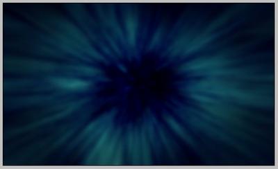
Create your canvas or just copy the following canvas.
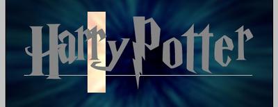
Using the Text Tool write out Harry Potter using your new font. Adjust the size to fill the canvas.
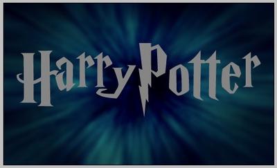
Adjust the spacing between the letters - as it stands now, most of them are too far apart when compared with the movie poster.Select the first two letters.

Adjust the tracking until the letters H and a look sufficiently close together.


Continue manually adjusting the other letters in the title using the movie poster for reference, squeezing in the spaces or expanding them where necessary.The next step is to add a bit of character to the text by raising some letters a hint.Drag the second r up - it's slightly raised in the movie poster. There's an easy way to shift this upwards without making a new text layer! Simply select the r:
And set the baseline shift up a few pixels.

This should push the r upwards!

Baseline shifts also work with negative numbers. Try selecting the second t and shift it downwards a few pixels.


Enter Layer Styles for your text layer.Select Bevel and Emboss and apply the following:
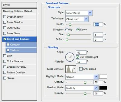
You should get this effect after applying the Hard Chisel:

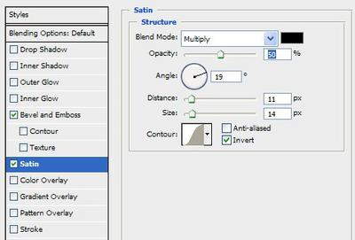
Add a subtle Satin effect to bring even more depth to your text:

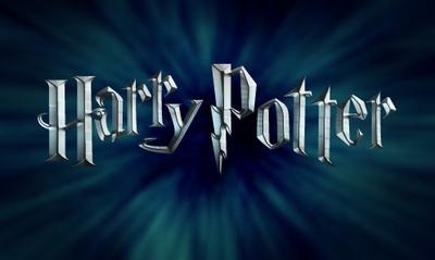
Add a Gradient Overlay. Here I'm making silver text with a pinch of blue, but you can change this gradient to be whatever colour you want.


And why not! A quick Drop Shadow.

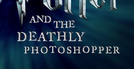
There you go! Silver Harry Potter Movie Text.
You can easily add in a tagline as well, use the techniques described above to make small adjustments to the font so it's not so monotonous.You may also need to use a different blending style than the one described above since this text is so thin. Here are the two I've used:


Optional Bronze Text
To change the gradient overlay to make bronze text sharp enough for any Ravenclaw:


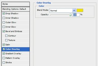
Optional Gold or Yellow Text
A Colour Overlay can also be applied, for that golden Gryffindor or yellow for the gentle Hufflepuff, if you prefer!

Final Product

Credit
© Grimsqueaker's tutorial was taken with permission from mintyferret.com.