MinaLima Discuss ‘Fantastic Beasts’ and 1920s Graphic Design
May 07, 2016
Fantastic Beasts Movie, Interviews, Movies, News, Pottermore, Props-Sets, SetReports
Ever wondered what it’s like to be inside the studio of Harry Potter and Fantastic Beasts head graphic designers, Miraphora Mina and Eduardo Lima?
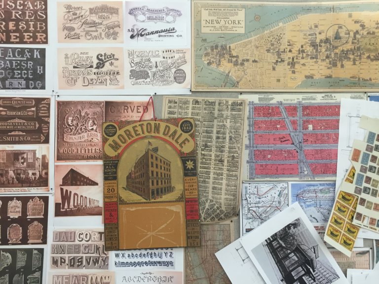
Pottermore gives us a sneak peak – describing the room as absolutely covered in ‘1920s maps, food labels, magazine covers, posters and sketches’. It’s clear that they’ve found a new favourite era of design:
‘The 1920s! What an era, especially in New York,’ says Mira. ‘That period is just a blessing for graphic designers like us.’
‘We always used to say the fifties or the sixties were our favourite era, but no – since working on this movie, the twenties are just everything,’ says Eduardo.
Take a look at some of the maps and adverts they’ve chosen for inspiration! The typography really reminds us of some of the Harry Potter graphic design props lined up in the Warner Bros. Studio Tour exhibits:
The two designers actually visited New York to research:
” ‘We went to the State Archives in New York to sift through the kinds of things that are mostly useless to everyone else. Everything from business cards and tickets to receipts, stamps and posters,’ continues Mira. ‘A couple of months later, we went to the opening of Harry Potter: The Exhibition in Paris and we spent four hours in this little Parisian shop going through more things from the era of this film.’
‘We’re nerdy like that…’ says Mira, with a sweeping gesture around the room. “
Read the full Pottermore article here (which includes more examples of 1920s graphic design), and read our exclusive interview on Fantastic Beasts with the duo at the Harry Potter Graphic Art Exhibition in London last November here!